
WhatsApp design has been radically updated
This week saw the release of a major update for the mobile versions of the WhatsApp application. After installing it, users of the service on Android and iOS devices will be able to experience the updated interface, which aims to make interaction with the app more comfortable.
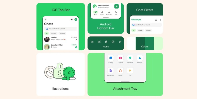
First and foremost, it's worth noting the change in the color palette of the interface. Green has become the accent color, used for highlighting notification icons and buttons. In the Android version of WhatsApp, more radical changes can be observed: the navigation panel has been moved to the bottom of the screen, making the app more similar to the iOS version.
Regarding WhatsApp's dark mode, it claims that the change in the color scheme will provide a higher level of contrast and richer dark tones to "reduce eye strain in low-light conditions." Developers note that users wanted to see a "darker mode," so it has been implemented in the app.
In the developers' message, they emphasize their aim to make WhatsApp a simple, reliable, and confidential application. The product design has been altered to make it easier for users to communicate with each other. One of the goals set by the developers is to make WhatsApp as convenient as possible for communication, and they strive to achieve it.
- Related News
- Instagram introduces "secret" Stories: What is it and how does it work?
- iPhone users can now login into WhatsApp without password
- WhatsApp adds new useful feature
- WhatsApp will get new and useful feature
- Apple removes WhatsApp, Telegram, Threads applications from App Store in China
- Meta unveils Llama 3 and claims it's the "most powerful" open source language model
- Most read
month
week
day
- iPhone will warn about nearby tracking devices: Apple releases iOS 17.5, which has several new features 821
- Huge spot on Sun generating powerful flares turns away from the Earth: When will it return and when should we expect next solar storms? 802
- 5 most dangerous smartphones in terms of SAR radiation levels 786
- OpenAI presents free AI model GPT-4o: It is smarter and knows Armenian 709
- Unitree unveils its new humanoid robot that cracks nuts, makes toast, does acrobatics and costs $16,000 691
- MIT students exploit ETH blockchain vulnerability to steal $25m in 12 seconds 683
- Gemma 2, Gemini 1.5 Flash and Pro, powerful AI image generator: What AI products were shown to us at Google I/O 2024 event? 677
- What unpleasant feature of 2024 iPad Air’s cheap version did Apple keep silent about? 667
- WhatsApp gets another new feature 666
- Sony abandoned 4K and 21:9 screen: Flagship smartphone Xperia 1 VI has been presented 664
- Archive